EuroSpaceHub
Visual identity and Brand System for a European space innovation consortium
00

challenge
EuroSpaceHub — a European consortium connecting universities, research centres, industry and startups in the space ecosystem — needed a visual identity that broke with aerospace conventions. The space sector is dominated by bold, aggressive, futuristic aesthetics that communicate power and technological dominance. The brief was different: design a brand that feels human, desirable and unexpected.
solution
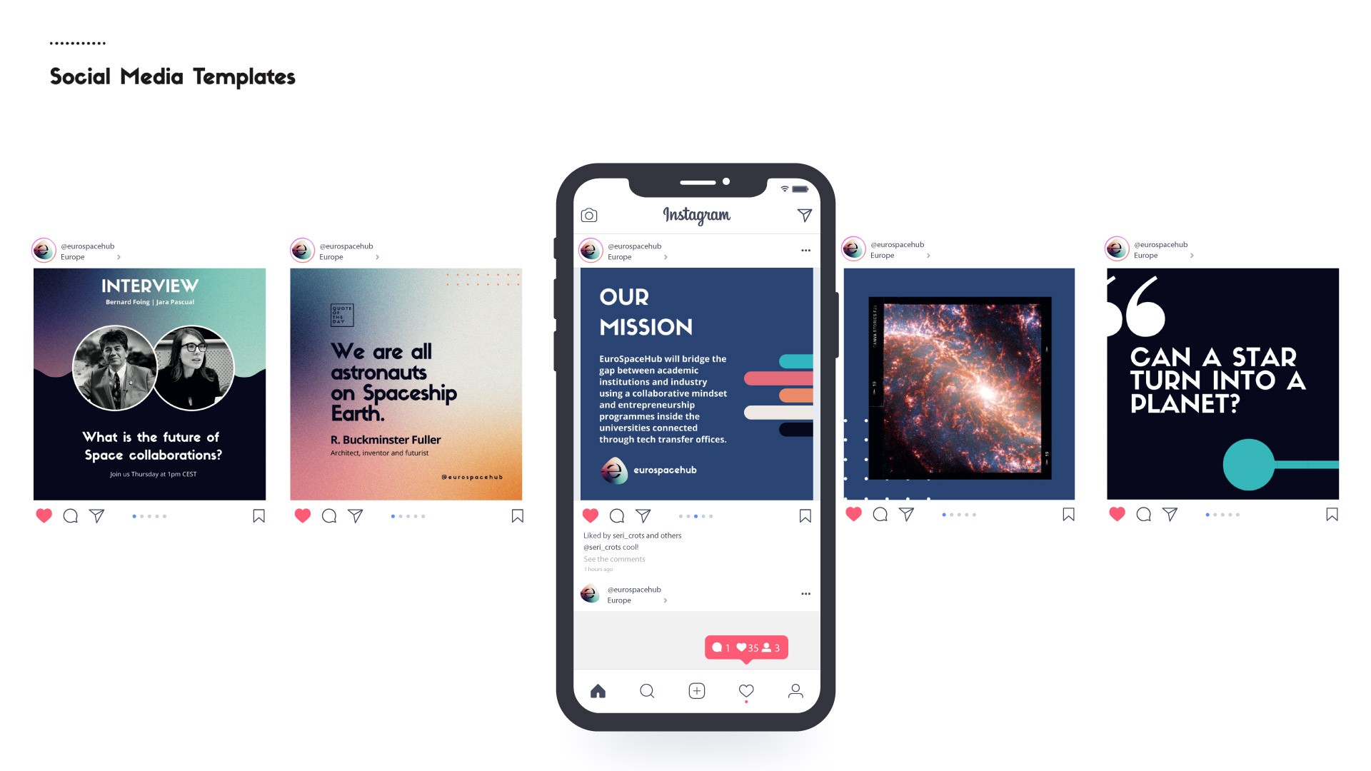
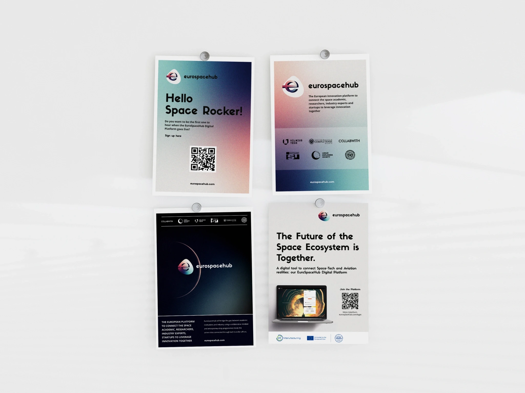
A comprehensive brand system built around a single visual insight: the sunset seen from the International Space Station. Warm orange hues emerging from deep blues — colours almost never associated with space aesthetics — became the identity signature. A grainy texture applied over soft gradients balances Space as future with Space as historical human achievement. The system covers logo, colour palette, typography, document templates, social media templates, printed materials and a sticker collection reinterpreting astronaut mission patches as friendly, colourful and surprising.
The brand system was adopted across all consortium partners and communication channels . A brand that looks to the future with roots in the past: the vintage inspiration grounds the project in the human history of space exploration, while the unexpected colour palette opens it toward a new, more inclusive vision of what the space sector can become. In a sector that communicates precision and ambition, EuroSpaceHub communicated curiosity, diversity and connection.
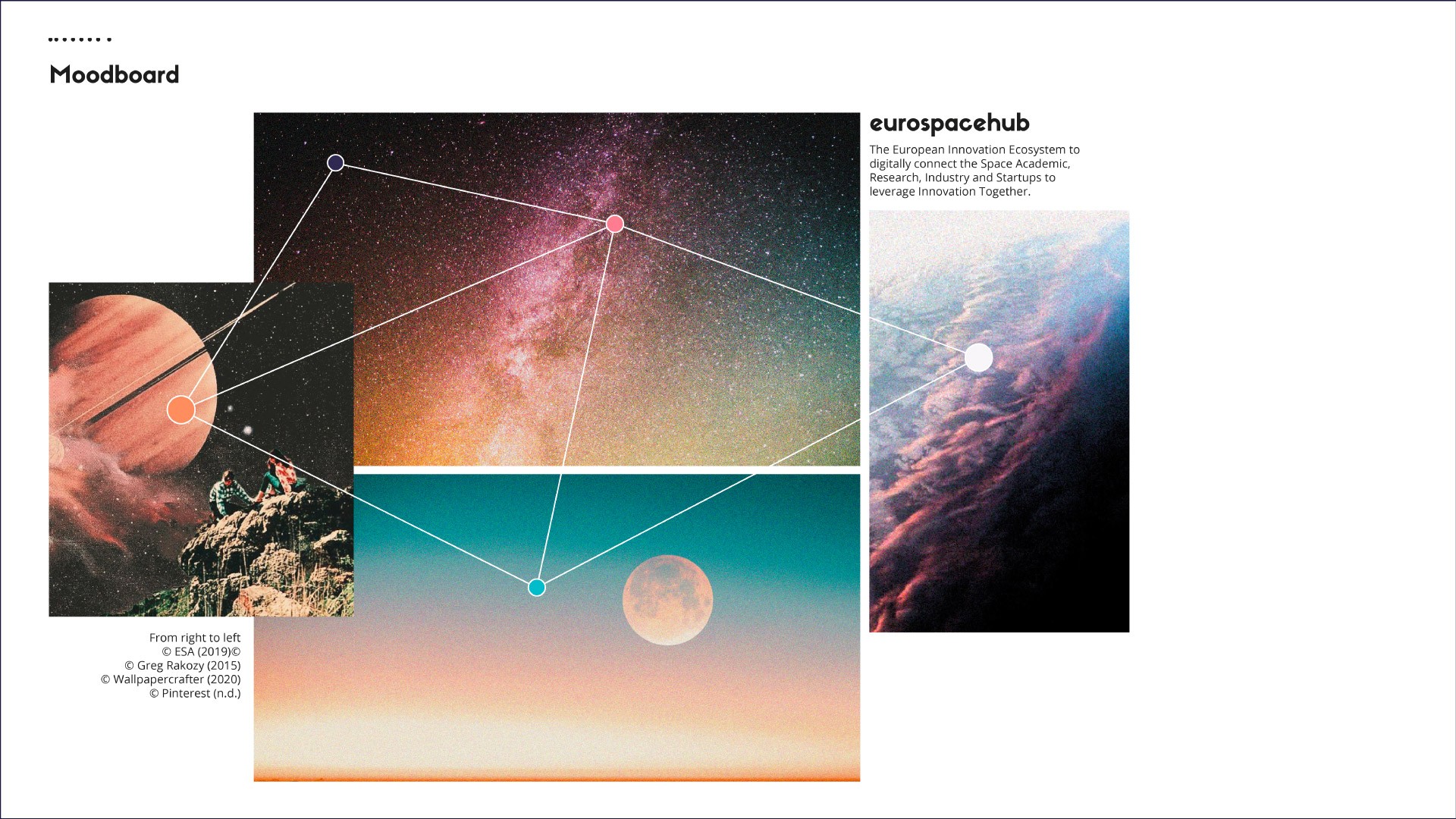
The competitive analysis revealed a consistent pattern in aerospace communication: dark backgrounds, sharp geometries, high-contrast palettes communicating power and technological dominance. The opportunity was not to look more professional — it was to look more human. The entire palette derived from a single inspirational source: the sunset photographed from the ISS. Warm oranges and pinks paired with deep blues and petrol green — unusual for aerospace, immediately distinctive. Grainy texture applied to gradients references old photographs and modern telescope imagery simultaneously.
Six founding partners, twelve associate partners, five countries, multiple languages. Consistency required not just guidelines but tools — templates for every touchpoint, designed to be used by non-designers without breaking the identity. The sticker collection applied the same logic to merchandising: astronaut mission patches reinterpreted as collectible, friendly objects. Space enters everyday life not through complexity but through desire.
01
Strategic Brief
The problem with space aesthetics
The brief started with a competitive analysis of aerospace communication — revealing a sector that consistently chose authority over humanity. The opportunity EuroSpaceHub identified was real: no major space consortium had built a brand around collaboration, curiosity and accessibility. That gap became the design direction.
02
Visual Identity
One image, one system
The entire visual language derived from a single source — the sunset photographed from the ISS. That image gave the palette, the mood and the conceptual frame: Space as something beautiful and human, not just technical and dominant. Grainy texture added the vintage dimension — Space as history as much as future.
03
System Design
Designing for a distributed consortium
Brand manual developed for six founding partners and twelve associate partners across five countries. Templates designed for every touchpoint — social media, presentations, letters, email signatures — to be used by non-designers without breaking the identity. Sticker collection designed as a low-barrier brand ambassador: mission patches reinterpreted as collectible, friendly objects that carry the brand into everyday life.
year
2022-2023
Client
EuroSpaceHub, co-funded by the European Union, EIT HEI Initiative



see also