Collabwith
Brand identity and UX design for an open innovation platform
00

challenge
Collabwith — an Amsterdam-based platform connecting academics, startups and organisations for open innovation — needed a visual identity and digital experience that made a complex system feel simple, warm and trustworthy. The risk: looking like another cold enterprise SaaS tool. The opportunity: becoming the "human" face of innovation infrastructure.
solution
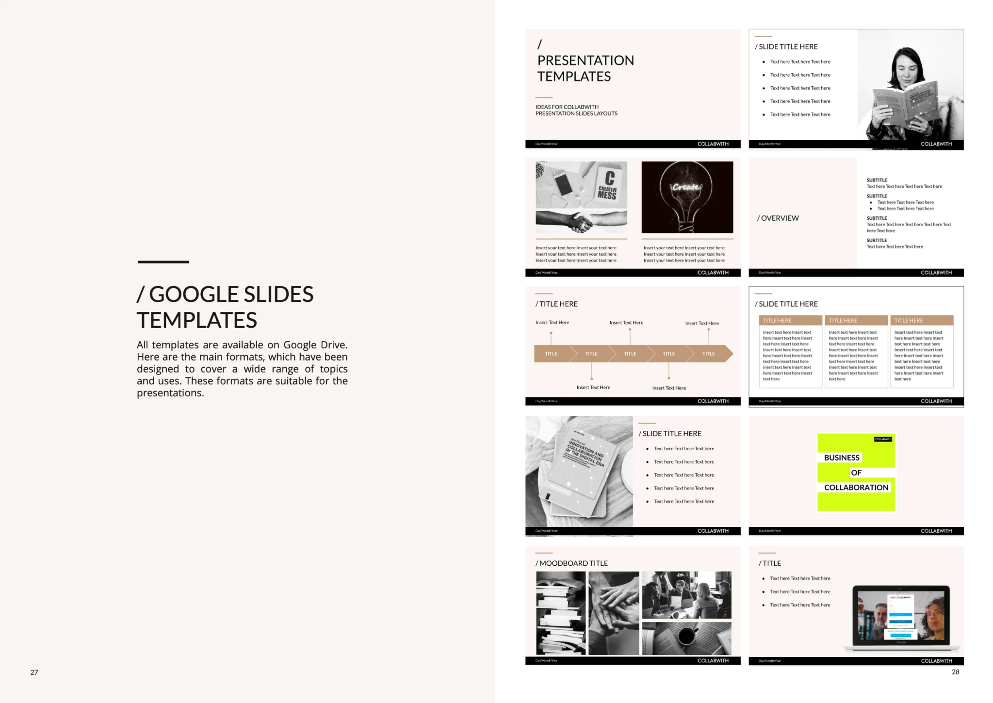
A complete brand and digital system across two parallel tracks. First, a brand identity built around warmth and reliability — a neutral palette of earthy tones anchored by a single lime green accent. Second, a full UX design of the platform — over 100 screens in Figma covering user flows, admin dashboards, data management interfaces and onboarding.
The brand system and UX design were implemented across the live platform and all communication touchpoints. Work organised in weekly sprint reviews with the development team — integrating developer constraints, founder direction and user feedback into each iteration. The design principle throughout: every complex action reduced to the simplest possible gesture.

The palette was built around earthy neutrals — warm beiges, browns and off-whites — that convey reliability and classicism. A single lime green introduced as the attention-grabbing accent: enough contrast to signal innovation, restrained enough to maintain elegance. Typography: Lato for all body and interface text — legible, versatile, accessible; Bodoni reserved for motivational quotes and inspirational content, adding a distinctive editorial register to specific touchpoints.
Over 100 screens designed in Figma covering the full platform experience: user onboarding flows, collaboration request management, funding opportunity matching, ecosystem dashboards, admin data management interfaces. Sprint-based collaboration with the development team and CEO — integrating real user feedback at weekly reviews. A tool is not enough to transform how you collaborate — the experience has to make the new way of doing things feel natural from the first click.
01
Brand Strategy
Warmth as a competitive advantage
Analysis of the innovation platform landscape revealed a consistent pattern: cold, corporate, feature-heavy interfaces that prioritise functionality over human experience. Collabwith's opportunity was different — a family company with twenty years of experience, committed to making collaboration feel personal. Key insight: in a sector defined by complexity, warmth is a strategic differentiator.
02
Visual Identity
Neutral tones, one accent
Palette built around earthy neutrals with a single lime green accent — enough contrast to signal modernity, restrained enough to maintain elegance. Typography system designed for dual purpose: legible and accessible for interface text, editorially distinctive for inspirational content.
03
UX Design
Making complexity invisible
100+ screens designed across the full platform — onboarding, collaboration flows, funding matching, admin dashboards. Each sprint began with user feedback from the previous iteration — constraints from developers, direction from the CEO, real usage patterns from the platform. The process was iterative by design — each sprint built on the previous one, integrating what had been learned into what came next.
year
2022-2023
Client
Collabwith


see also